The White Album and You
The Beatles have arguably the most widely recognizable and iconic collection of album covers ever to be produced by a single group.
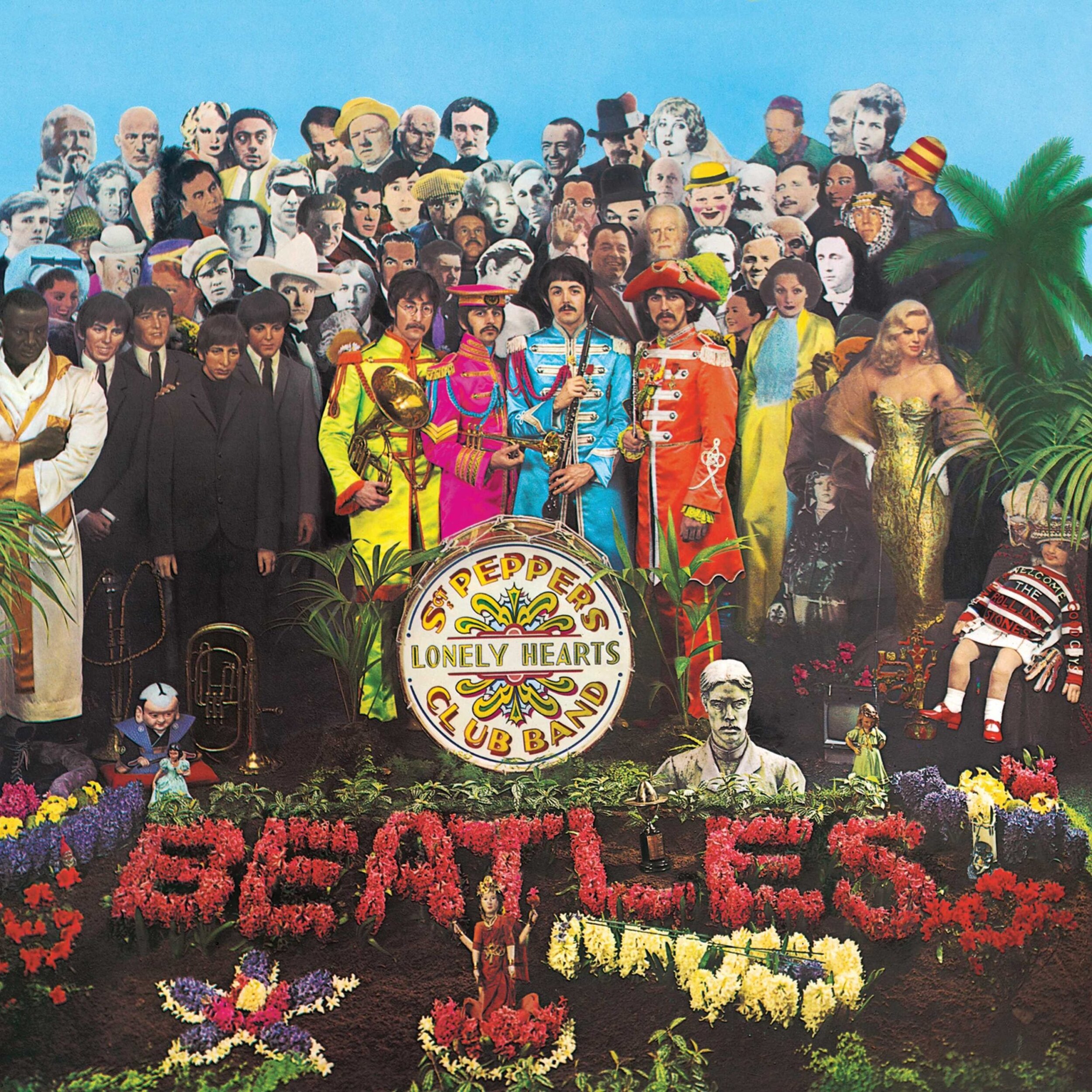
The images on the album covers follow the trajectory of a band whose style was ever evolving. From the relatively simple and direct photography of their first several albums, to the first hint of a psychedelic aesthetic on Rubber Soul (1965), to the bright, over-the-top Sgt. Pepper’s (1967), the Beatles offered innovation in album visuals as well as musical style.
After the psychedellic maximalism of the covers for Sgt. Pepper’s (1967) and Magical Mystery Tour (1967), the Beatles’ White Album (1968) is a shocking departure. In original pressings, the cover is completely white but for a stamped serial number on the front. “The Beatles” is embossed rather than printed, a tactile effect that cannot be reproduced in digital versions of the cover. The cover is plain—even lacking—but also enticing.
The work of New York conceptual artist Rutherford Chang represents the fascination surrounding the White Album cover. Chang has collected over 2500 copies of the album, and has exhibited this collection in several galleries. He also maintains an Instagram dedicated solely to photographs of White Albums (@webuywhitealbums).
Part of the allure of the White Album lies in the apparent lack in the plain cover, a lack that begs for completion and invites addition. It brings the consumer in as a co-creator of the album’s meaning.
At the same time that the Beatles’ were cutting records in the 1960s, literary theorists were thinking about the relationships between authors, their works, and readers/consumers of their work. One unspoken assumption was that authors determined the meaning of their works, and readers were basically just passive receivers of that meaning. Against this idea, Roland Barthes described what he called “the death of the author,” the notion that meaning is created not by the author, but by the reader and her relationship to the work. In a similar vein, Umberto Eco formulated ideas about “open works,” works of art, music, or literature in which the creator intentionally leaves the performer, reader, or audience to make sense of the work (or perhaps even complete it themselves).
The White Album cover is fascinating because it presents itself as an “open work.” It is your relationship with the album that completes it. Unlike a typical album with graphic art saturating the entire cover, the cover of the White Album highlights each stain, scratch, and mark. Intentional or unintentional, these visual additions to the White Album signify your relationship to that specific album.
Perhaps you idly trace the embossed “Beatles” with a pen while listening. Or draw your own sketch of your favorite Beatle on the front. (It’s Ringo, right?) Maybe there are coffee stains, or sun-yellowed areas—visible imprints of past interactions with and locations of the album. Even simple wear and tear accumulates to make this mass-produced album cover an object unique to you.


