
Why We Still Recognize Albums by Their Color
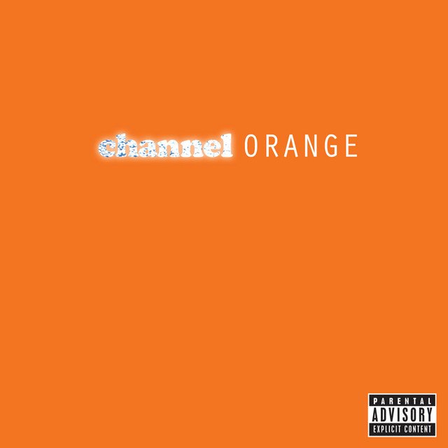
Frank Ocean Channel Orange
“Put on the orange one.”
It sounds like an odd request until you realize exactly what it means.
For decades, people have referred to records not by title, artist, or even genre, but by color. The white one. The black one. The pink one. The rainbow one. Somewhere between the record store and the streaming era, album artwork became less of a package and more of a cognitive shortcut—a visual fingerprint for music.
Our brains don’t simply remember songs. We remember what they looked like.
Music Has Always Been a Visual Experience
Psychologists have long understood that memory improves when multiple senses are involved. Allan Paivio’s Dual Coding Theory, introduced in the 1970s, proposed that information encoded both verbally and visually is recalled more effectively than information presented in only one form.
Album covers became one of the most successful examples of this principle in popular culture.
Before a listener ever heard Kind of Blue, they encountered its cool blue photography. Before hearing Nevermind, they saw the underwater baby. Before the first note of The Dark Side of the Moon, they already knew the prism.
The image wasn’t decoration, it became part of the memory itself.
Color Becomes Identity

Researchers studying consumer behavior have found that color dramatically influences recognition and recall. Depending on the study, color can increase brand recognition by as much as 80%.
Record labels discovered this decades before marketers began measuring it.
Think about albums that can be identified from a single dominant color:
The stark white minimalism of The Beatles’ White Album
Prince’s saturated purple world on Purple Rain
The fluorescent orange of Frank Ocean’s Channel Orange
The muted green of Radiohead’s In Rainbows
Tyler, the Creator’s powder-blue IGOR
Eventually, the artwork stops representing the music.
The color itself becomes the music.
It’s why someone can walk past a tiny square of orange across a room and instantly hear Frank Ocean in their head.
Streaming Flattened That Experience
When CDs replaced vinyl, artwork shrank.
When streaming replaced CDs, it shrank again.
Today, album covers often appear as icons barely larger than a postage stamp. On smart speakers, they’re frequently absent altogether. Music has become increasingly ambient, while its visual identity has quietly disappeared.
Ironically, listeners are consuming more music than ever while seeing less of it.
This matters because removing visual context changes the experience.
Neuroscientists studying multisensory perception consistently find that our brains integrate information across senses. Vision doesn’t simply accompany sound—it changes how we interpret it.
The artwork wasn’t competing with the music.
It was completing it.
Some Albums Are Inseparable From Their Palette
Imagine these records with different colors.
Could Blue by Joni Mitchell be red?
Would Kid A work in warm yellows?
Would Unknown Pleasures carry the same emotional weight if Peter Saville’s black sleeve were bright white?
Probably not.
Designers often describe color as emotional architecture. Long before we consciously process typography or composition, we react emotionally to color.
Album artwork exploits this instinct.
It primes us before the first note ever arrives.
The Digital Shelf Still Exists
People often argue that streaming killed album art.
History suggests otherwise.
The format changed, but human perception didn’t.
Listeners still build playlists with carefully chosen cover images. Vinyl sales continue reaching levels few predicted a decade ago. Limited edition variants sell largely because of alternate artwork. Social media platforms remain overwhelmingly visual.
The desire never disappeared.
Only the canvas did.
Looking Before Listening
Perhaps that’s why so many people instinctively pause when a beautiful album cover appears on a screen.
For a brief moment, they’re no longer skipping tracks.
They’re looking.
Exactly as listeners did while flipping through record bins in the 1970s.
Exactly as CD buyers did in music stores during the 1990s.
Exactly as designers like Reid Miles, Storm Thorgerson, Peter Saville, and Paula Scher hoped they would.
Because despite every technological shift over the past seventy years, one truth has remained remarkably consistent:
We don’t just hear albums.
We remember what they looked like.
