Reid Miles: The Blue Note Maestro Who Painted Jazz in Colors
Ah, Reid Miles. The name alone conjures up visions of cool cats in smoky clubs, bebop rhythms dancing on the airwaves, and album covers that were as much art as they were advertisements. Miles, the undisputed king of Blue Note Records' visual identity, wasn't just slapping photos on cardboard. He was a jazz alchemist, transforming musical moods into vibrant explosions of color and shape.
History
Born in 1927, Miles stumbled into the world of design almost by accident. A stint in the Navy honed his skills in photography and graphic design, and by the early 50s, he found himself working for the legendary Blue Note label. This was a match made in artistic heaven. Blue Note, with its commitment to adventurous, boundary-pushing jazz, needed a visual language that was equally bold and innovative. And Miles? Well, he had a paintbrush dipped in pure bebop.
His early covers were explosions of energy. Think bold typography, playful collages, and abstract shapes that seemed to pulsate with the rhythm of the music. Take Herbie Hancock's "Takin' Off," for instance. That cover, with its dynamic diagonal lines and contrasting colors, is a visual rollercoaster ride that mirrors the album's frenetic energy.

Herbie Hancock's Takin' Off album cover
But Miles wasn't just about the flashy. He could also do subtle, like the iconic cover for John Coltrane's "Blue Train." That minimalist masterpiece, with its stark blue background and single, sinuous train track, perfectly captures the album's introspective mood.

John Coltrane's Blue Train album cover
Over the next two decades, Miles churned out hundreds of covers, each one a testament to his incredible versatility and deep understanding of jazz. He worked with photographs, illustrations, typography – whatever it took to capture the essence of the music. His covers became instantly recognizable, a visual shorthand for the Blue Note sound.
But here's the thing, and this is where the blog post takes a spicy turn: I think Miles' later work, while technically impressive, lacked a certain... soul. Don't get me wrong, the man was a genius. But as he moved towards more abstract, conceptual designs, I feel like he lost touch with the raw emotionality of jazz. His covers became cool, yes, but they also felt a bit sterile, like museum pieces rather than windows into a smoky, vibrant club.
Now, this is just my opinion, and I know there are plenty of Miles purists out there who will disagree. But I think it's important to have these conversations, to challenge the status quo and keep the artistic flame burning bright. So, what do you think?
One thing's for sure: Reid Miles left an undeniable mark on the world of music and design. His album covers are more than just pretty pictures; they're time capsules, transporting us back to a golden age of jazz and reminding us of the power of music to move, inspire, and ignite our imaginations.
Beyond Photos: Miles' Hidden Talents
While Miles often collaborated with photographers like Francis Wolff, he wasn't afraid to get his hands dirty himself. He experimented with collage, creating playful compositions like Art Blakey's "A Night in Birdland," where instruments and musical notes dance across the canvas, evoking the joyous chaos of a live jazz performance.

Art Blakey's A Night in Birdland album cover
Secret Weapon: Typography as Art
Miles understood the power of typography, using it not just to identify artists but to visually echo the music's rhythm and emotion. The bold, slashing font on Horace Silver's "Horace Silver and the Jazz Messengers" mirrors the album's driving, hard-bop sound, while the delicate script on Lee Morgan's "The Sidewinder" hints at the album's cool, bluesy swagger.
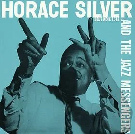
Horace Silver's Horace Silver and the Jazz Messengers album cover
More Than Just Covers: Miles' Unsung Legacy
Miles' influence wasn't limited to album covers. He designed posters, logos, and even entire advertising campaigns for Blue Note, all with the same signature blend of creativity and deep understanding of the jazz world. He even dabbled in album production, co-producing Jackie McLean's "Right Now!" and lending his keen ear to countless recording sessions.
The Need for Reid
Whether you're a die-hard Miles fan or simply a curious music lover, there's no denying the impact he had on the world of jazz and design. His album covers are more than just pretty pictures – they're testaments to his incredible versatility, his deep understanding of music, and his unwavering dedication to pushing the boundaries of creativity. So next time you spin a Blue Note record, take a moment to appreciate the artwork on the sleeve. It's not just a cover, it's a portal to a world where music and art collide in a symphony of color, shape, and soul.